Editorial features
Give a long article one reading column and a small number of deliberate interruptions. A picture can establish the subject; a quotation can change the voice; a side note can hold context that would interrupt the main argument. The layout should make those relationships visible before the reader scrolls.
An article with a source note
The main column below carries the story. The side note identifies the source and limits the claim. On a narrow screen, the note follows the text in the same DOM order; no content depends on its desktop position.
The typeface survives the format
Font libraries contain more than outlines. Names, spacing, kerning and family structure carry decisions that designers made for the way the typeface would be used.
A format change puts those decisions under pressure. A studio may still need the typeface for an identity or a book, even when its current applications no longer accept the original files. Conversion begins with the question of what must survive the move.
What got lost in the handover was hand-tuned data. Years of careful kerning. Style links that lined up with how a designer actually used the family. Naming that matched the printed specimen.
The FontLab article TransType, the converter that outlived the format follows that problem from an old font library to a working typeface. It also separates format conversion from further editing: the next job may be extending a character set, adding OpenType features or working on the family in FontLab.
The conversion still needs inspection. Compare the names and family grouping, then examine spacing and kerning in representative text. Keep the original files so you can compare what changed.
<div class="fl-editorial">
<article>
<h2 id="the-typeface-survives-the-format">The typeface survives the format<a class="headerlink" href="#the-typeface-survives-the-format" title="Permanent link">¶</a></h2>
<p class="fl-lead">Font libraries contain more than outlines. Names, spacing, kerning and family
structure carry decisions that designers made for the way the typeface would
be used.</p>
<p>A format change puts those decisions under pressure. A studio may still need
the typeface for an identity or a book, even when its current applications no
longer accept the original files. Conversion begins with the question of what
must survive the move.</p>
<blockquote>
<p>What got lost in the handover was hand-tuned data. Years of careful kerning.
Style links that lined up with how a designer actually used the family.
Naming that matched the printed specimen.</p>
</blockquote>
<p>The FontLab article <em>TransType, the converter that outlived the format</em> follows
that problem from an old font library to a working typeface. It also separates
format conversion from further editing: the next job may be extending a
character set, adding OpenType features or working on the family in FontLab.</p>
<p>The conversion still needs inspection. Compare the names and family grouping,
then examine spacing and kerning in representative text. Keep the original
files so you can compare what changed.</p>
<p><a class="md-button" href="https://www.fontlab.com/font-converter/">Explore font conversion</a></p>
</article>
<aside class="fl-editorial-note">
<h3 id="from-the-archive">From the archive<a class="headerlink" href="#from-the-archive" title="Permanent link">¶</a></h3>
<p>The quotation comes from the FontLab blog's February 2024 TransType article.
The surrounding text is adapted for this layout demonstration.</p>
<p>The original article marks some historical dates for verification. Those dates
are not repeated here. This specimen is an editorial layout, not a current
product compatibility statement.</p>
<p><a href="https://blog.fontlab.com/2024/02/13/transtype-the-converter-that-outlived-the-format/">Read the source article</a></p>
</aside>
</div><div class="fl-editorial" markdown="1">
<article markdown="1">
## The typeface survives the format
Font libraries contain more than outlines. Names, spacing, kerning and family
structure carry decisions that designers made for the way the typeface would
be used.
{ .fl-lead }
A format change puts those decisions under pressure. A studio may still need
the typeface for an identity or a book, even when its current applications no
longer accept the original files. Conversion begins with the question of what
must survive the move.
> What got lost in the handover was hand-tuned data. Years of careful kerning.
> Style links that lined up with how a designer actually used the family.
> Naming that matched the printed specimen.
The FontLab article *TransType, the converter that outlived the format* follows
that problem from an old font library to a working typeface. It also separates
format conversion from further editing: the next job may be extending a
character set, adding OpenType features or working on the family in FontLab.
The conversion still needs inspection. Compare the names and family grouping,
then examine spacing and kerning in representative text. Keep the original
files so you can compare what changed.
[Explore font conversion](https://www.fontlab.com/font-converter/){ .md-button }
</article>
<aside class="fl-editorial-note" markdown="1">
### From the archive
The quotation comes from the FontLab blog's February 2024 TransType article.
The surrounding text is adapted for this layout demonstration.
The original article marks some historical dates for verification. Those dates
are not repeated here. This specimen is an editorial layout, not a current
product compatibility statement.
[Read the source article](https://blog.fontlab.com/2024/02/13/transtype-the-converter-that-outlived-the-format/)
</aside>
</div>Local source: blog.fontlab.com/src_docs/md/posts/2024-02-13-transtype-the-converter-that-outlived-the-format.md.
The introduction also adapts www.fontlab.com/src_docs/md/font-converter.md.
Alternate text and image without changing reading order
An image-led feature works when the image supplies evidence. Keep the headline, description and destination together. A caption should explain what to inspect rather than repeat the headline.
Lines from an image
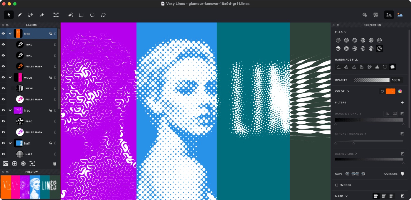
Vexy Lines reads tone, edges and shapes, then draws with mathematically defined strokes. You choose the fill and direct the composition with layers and masks.
Linear, Wave, Circular and Halftone fills make different decisions about the same source image. A portfolio can show those differences beside the text that explains them.
<div class="fl-feature">
<div>
<h3 id="lines-from-an-image">Lines from an image<a class="headerlink" href="#lines-from-an-image" title="Permanent link">¶</a></h3>
<p>Vexy Lines reads tone, edges and shapes, then draws with mathematically defined
strokes. You choose the fill and direct the composition with layers and masks.</p>
<p>Linear, Wave, Circular and Halftone fills make different decisions about the
same source image. A portfolio can show those differences beside the text
that explains them.</p>
<p><a class="md-button" href="https://www.vexy.art/lines/">Explore Vexy Lines</a></p>
</div>
<figure>
<p><a class="glightbox" data-desc-position="bottom" data-height="auto" data-type="image" data-width="auto" href="https://i.vexy.art/vl/landing/home-vexy-lines.jpg"><img alt="Colourful vector artwork from the Vexy Lines product page" loading="lazy" src="https://i.vexy.art/vl/landing/home-vexy-lines.jpg"></a></p>
<figcaption>Look at the change in line direction, density and rhythm across the artwork.</figcaption>
</figure>
</div><div class="fl-feature" markdown="1">
<div markdown="1">
### Lines from an image
Vexy Lines reads tone, edges and shapes, then draws with mathematically defined
strokes. You choose the fill and direct the composition with layers and masks.
Linear, Wave, Circular and Halftone fills make different decisions about the
same source image. A portfolio can show those differences beside the text
that explains them.
[Explore Vexy Lines](https://www.vexy.art/lines/){ .md-button }
</div>
<figure markdown="1">
{ loading="lazy" }
<figcaption>Look at the change in line direction, density and rhythm across the artwork.</figcaption>
</figure>
</div>Text adapted from www.vexy.art/src_docs/md/lines/index.md. The image is the
Vexy Lines landing-page artwork, also used by this repository's existing image
reference. It is not a generated substitute.
Adapt the composition
Use .fl-editorial for an article and a short contextual aside. Use
.fl-feature for text beside one image. Both classes come from
assets/stylesheets/field-guide.css and collapse to one column below 800px.
Keep this stylesheet with copied HTML if the destination does not load it.
The article comes first in the source. If you alternate image positions across several rows, keep the text's reading order consistent and test how each row stacks on a phone. A decorative reversal should not put an unexplained image between a heading and its paragraph.
Keep essential limitations in the main column. A source note is optional context; a condition that changes the reader's next action is not.