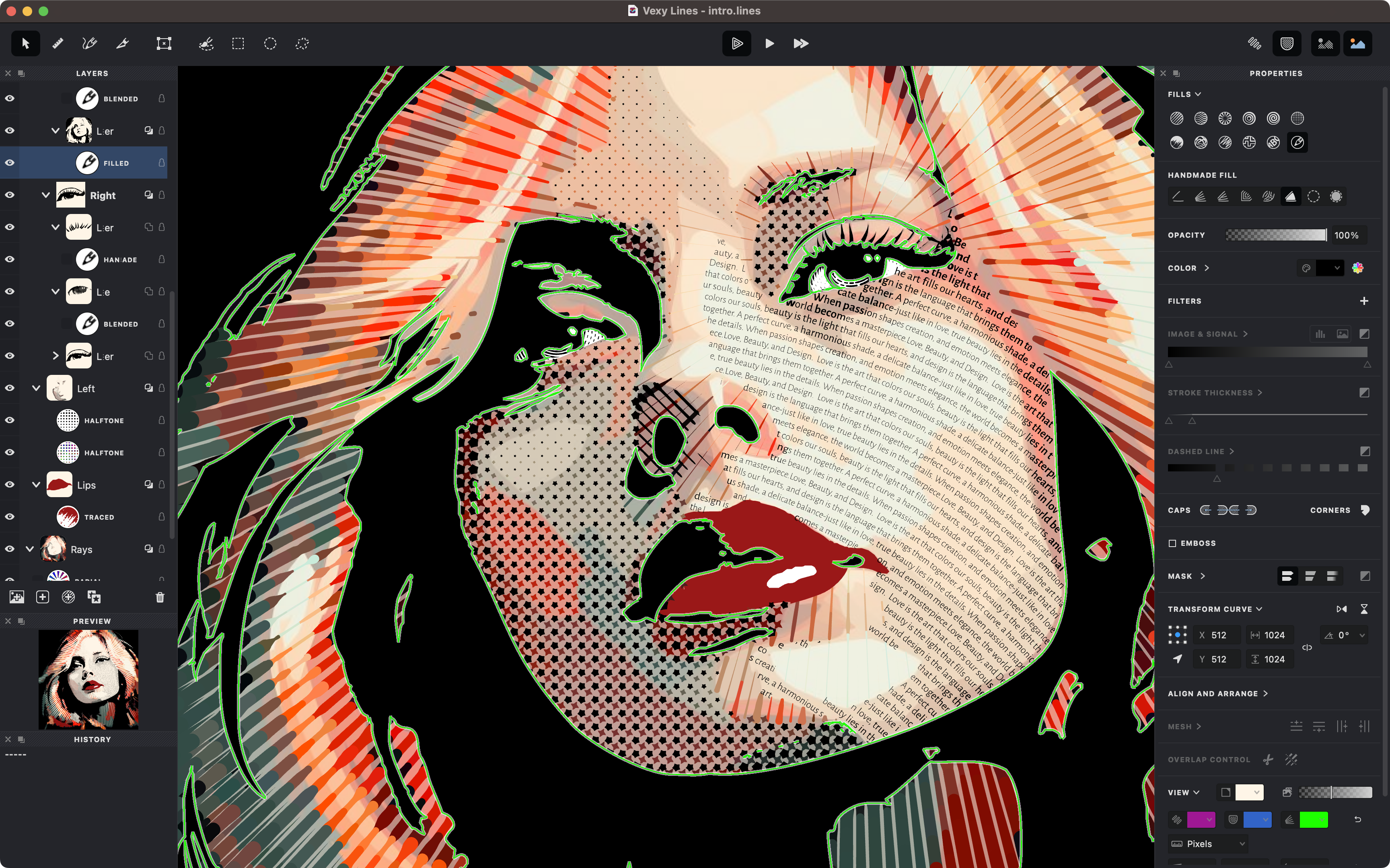
Vexy vector imagery
Vexy Lines pushes the theme harder than the writing guide. The imagery is brighter, denser, and more kinetic; the docs chrome should hold it without turning into a dark marketing landing page.
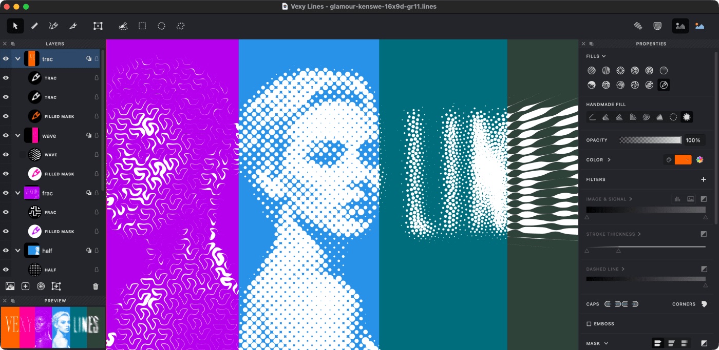
The reading column stays narrow for comfort while an image can slip into the right margin beside the text, keeping the words and the picture in the same eye line instead of stacking them.

Full-bleed images run from the left edge of the text all the way to the right edge of the viewport, so a wide studio capture can breathe without being boxed into the measure. Everything else — headings, paragraphs, lists — holds a steady, readable line length.